Year 2013 & Year 2014 2

Year 2013 & Year 2014 2
Showing posts with label Tim Holtz Unchartered Mariner Oxide Ink. Show all posts

Tuesday, August 9, 2022

The Funkie Junkie Boutique Challenge #16 Chillin' in the Heat...The Pool Works!


     S
ummer is blowing by and whether I like it or not, the heat won't stay as strong as it was. Funny thing that, loving the heat while wanting to stay cool in it. Yet, that's the way we roll. I'm like a woman on a mission this week, with so many lose ends to tie up before the end of August gets here, finishing up Sunday School Lessons; I've only got two more to finish making and printing out and I will have a full file of 52 reusable lessons fitting in up to 12 kids at once, for my PreK/1st Grade class. That was a 2-year project if there ever was one! The other goal is to get caught up in my Craft Room with all my "Want to Do" full list of items. Tim Holtz is not making it any easier- and neither is Eileen Hull, by the way- with all their new Chapter 3 products that are soooo cool! What Crafter ever said, "I have enough," without revisiting that with, "I lied," lol!

    We've had a wee bit of excitement in our planning for trips to New York for the soon-to-be-due Newest Grandbaby. Younger Daughter had a bit of high blood pressure, and we were...concerned.... about that meaning the baby would have to come as early as 4 weeks. I hesitated with the word 'concerned' because when the news got to me, I simply freaked out. I had our first was just over 4 weeks early and that ended up with lasting effects for our older Son that passed on to our Princess Pistachio- temperature problems and febrile seizures. Not to even mention that Baby Pecan was going to need someone with him while only one person gets to be at the hospital (which is still somewhat under Covid19 rules). Things settled down over the weekend and we enter into this "3 weeks to go" phase with a bit less anxiety. The older Daughter has had some very rough times also, and I immediately went into prayer mode for BOTH! For parents who think they're off the hook once their kids turn 18: forget that! When you bring a child into this world, a true gift from GOD, being a parent never ends. The type of care changes, and your relationship deepens even as they continue to branch out and create their own families in their own homes, but the concern and urge to make sure they're always "ok" still manages to overflow in your heart. It multiplies all the more as your family grows bigger.  

   This new Funkie Junkie Boutique Challenge is called "Chillin' in the Heat" and I'm taking the lead on it with challenging you to think about these last days of Summer before School begins. What's your favorite part; the heat of the sunshine and laying by the pool or on the beach... or keeping cool in the water, and loading up on cold lemonade in the shade? Let's see a tag, panel, book, or even 3D project using either HOT design using warm colors (red, orange, yellow. etc) or COOL design using cool colors (blues and greens). Use your dies, stamps, pastes, etc, at your will to dress up your design and compliment your idea of the perfect degree!

     While the heat of summer is definitely my thrill, chilling out in the BLUES are my fave things!! All my Grands have baby blues, the 2 older went with Mommy to buy a blue Subaru, and my LA Dodgers are definitely blue hitting out into the blue! I so miss those JT/Adrian selfie moments, and we're ALL going to miss Vin! My Hunni Pi is feeling blue along with me at the thought.




                           I'll show you where the COOL colors took me!


Here are some LINKS to help you find products I've used:


I chose 2 different sheets from the TH Backdrop Papers (double-sided) with
complimenting patterns. One might say the solid was a 'leather' but when I stared at it,
I decided it could pass for metal also, which was my goal. Both sheets covered 
the TH Etcetera Mini Tag nicely with excess to spare.
Not wanting to waste any, I chose to use the 1st sheet's leftovers for edges on the blue backside.

The backside here was going to be the water side. The blue...cells??.... will end up
adding a nice touch of whimsy in the end result.

Each layer would need to be rusted in order for the edging to look right.
So, when it came time for coloring plastics (shown in later pics below), I used alcohol inks.
For the paper layers; I used TH Distress Paint in Walnut Stain with that yummy
retired TH Embossing Distress Powder in Vintage Photo.
Heat setting everything along the way got me into a jam with the plastics at one point.
(I'll show you when we get to that.)

Meanwhile- the plastic was the layer on top of the 'water' with the green rusted on top of that.

Cutting up some plastic trash and figuring out which TH Bigz Die I was going to use with it all.

Here's my Creative Chaos! Trying to decide if I was going to add more paper color
or just use the one TH Kraft Stock (shown up near the Pipeline Bigz)
I originally planned on using. I stuck to my plan.
But, changed one thing: I got out the foil/cardstock for some faux metal pieces.

Here's some heavy-duty foil taped to plain white cardstock scrap.
Don't let lines concern you; they will not show up after embossing with Tim's 3D Folders!
(Which was my next step for each piece except the very bottom of the light bulb.)

Time for the piping- the water was going to look 'totally ikky' and that's why this weird geenish
twin of the blue cell paper was perfect for the piping and kept within the Challenge's colors.
Remember to FOLLOW DIRECTIONS for the Challenges- the point of the challenge!

I cut doubles of everything in case overlapping pieces could be seen from
the other side of the tag when my project was finished.
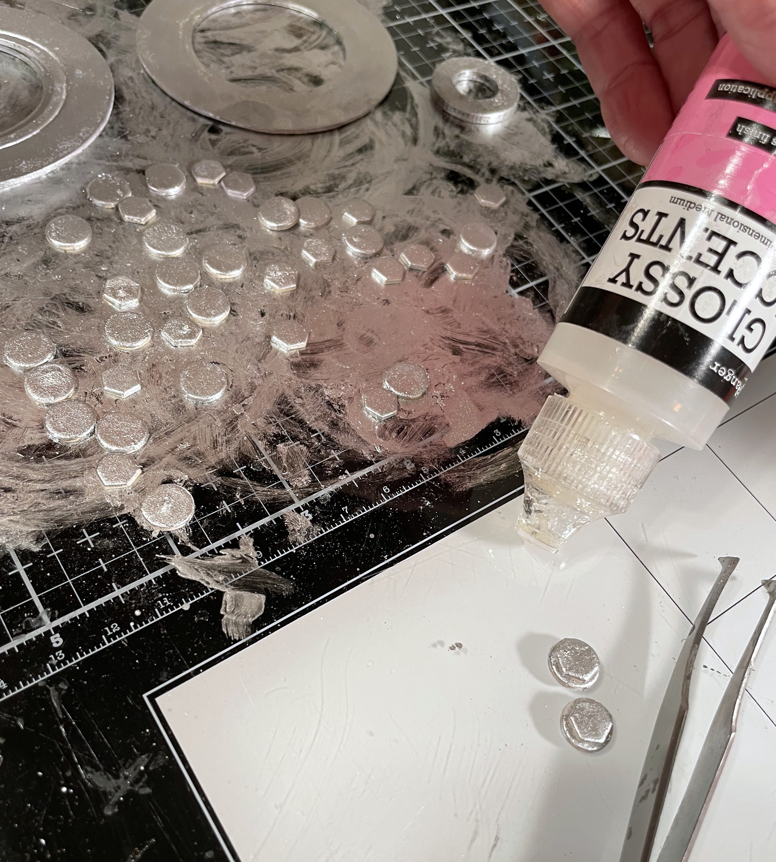
I used my Glossy Accents (my 'go to' glue), as usual.
I made sure to fit each of the pieces I needed onto the tag FIRST- this way 
I didn't have any leftovers of wasted paper. THEN I die cut all the plastics to fit.
This meant having those other sides also covered- if they overlapped to the back side of the tag.
Set those plastics aside for now. We've got another step to do first....

... Rusting up the piping paper. And fitting them together into one full piece.
All the heat drying needed to be finished up in this step.
Once we get to the plastics... no more heat!

Now it's time for the plastics.... adding some Alcohol Ink in Ginger all around the plastic edges.
That just added to the rust and depth for the piping look.
Notice you don't see any AI on this piece yet- so you can see the difference from the result.

Here's the AI getting done.
Then all the plastics adhered to the papers after this.

I DID try some of the Foundry Wax on these pieces. But, sadly, none of it was going
to end up showing up as only the last coats would get the wax and the
plastic would already be inside- I wouldn't be able to heat it up.
I'll have to think on that for a bit and see if I can figure out how to make it happen next time.
Meanwhile... I used my usual Alcohol Metallic Ink.

Same here: die cut the pieces, color them all in AInk and glue them together
before adding them onto the finished layer.

That Industrious 3D Folder, tho!!!
It worked FABULOUSLY on the TH Voltage Die pieces!
Again- the Foundry Wax was not able to be used on this for the same plastics reason.
This was my first chance to finally get those TH IdeaOlogy Dials out!!!
I grew up around my Grandpa's restored antique cars, 
so, I can tell you that these dials are
definitely realistic

And what to do for the post windows??
I heared Ollie Octopus calling out my name.
She knows it's about "that time of year" once again. :`(


And here it comes: the Pool Works!
(And yes, it does work up till a few weeks from now.)


The Pool Works FRONT


That crack is a happy accident! I think it added a lot of charm!


The Pool Works BACKSIDE


The rope is tied like a sailor ties!
How cool is that Tag's hole reinforcer?!
Put Metallic Silver Alcohol Ink on it, brush it up with some Black Soot Distress Ink,
and it almost looks REAL!

Plain plastic portal closed, but you can easily check the water color...?? LOL!
I only wish I had completely cleaned up that Foundry Wax dust all over
before I headed out to take photos for the finished results. 
*sigh*
Live and learn.

Poor little Ollie Octopus!
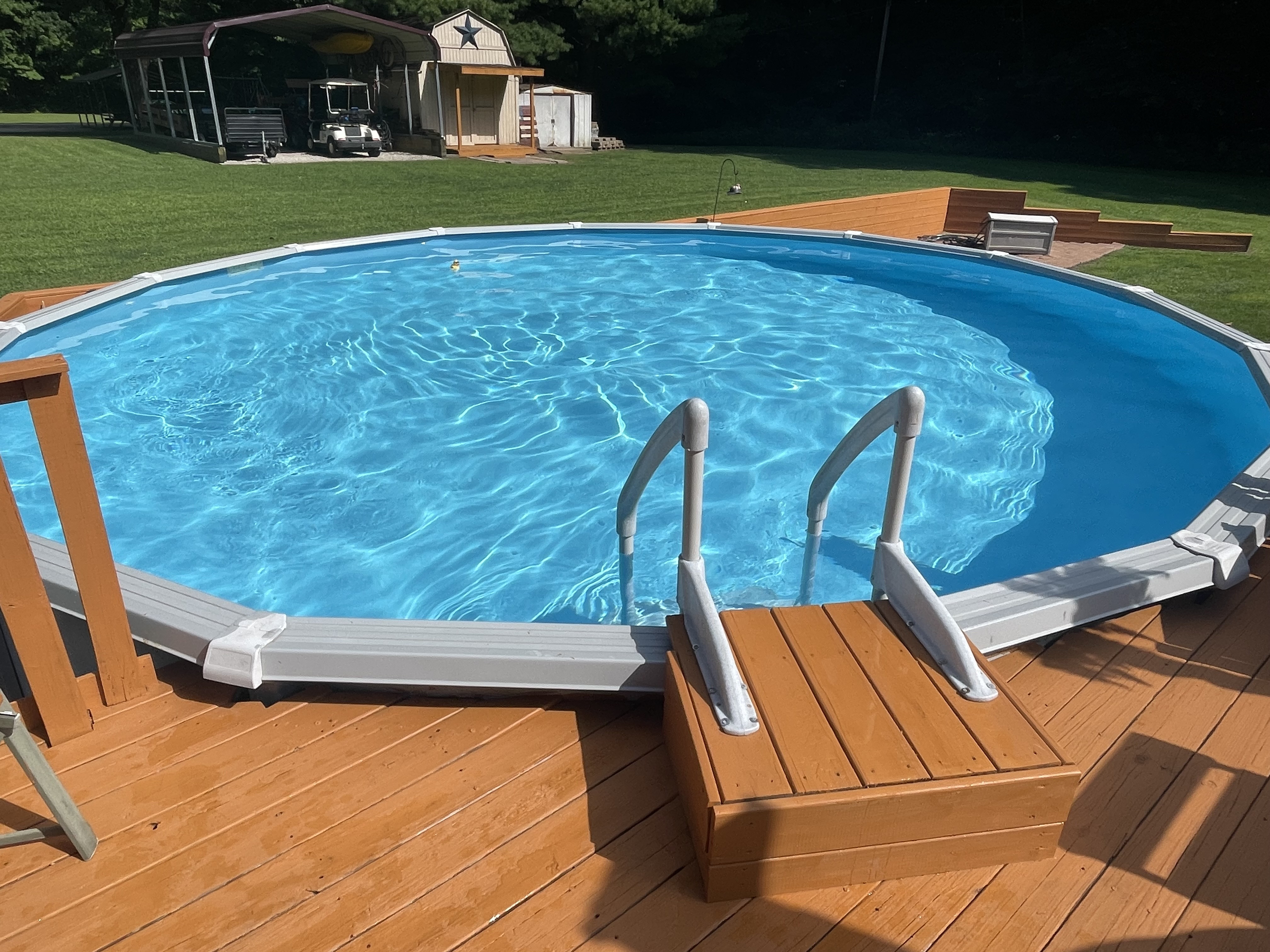
She's deadset on NOT closing up that pool!
She's just gonna sit in there all by herself. Just until that first ch-ch-chilly day,
then she's gonna pack it in...
And head for FLORIDA!


I absolutely detest closing the pool. It's one of my very UNfavorite chores.
The older 3 Grandbabies have morphed into fishies this year, and that's going to hurt.
But this year, closing earlier than normal has a good ending:
GRANDBABY NUMBER FOUR!!!
That's the reason I'll be spending September to October up there in New York.
Probably going to need some battery-operated undies to keep me warm in the tooshie.
But my heart will be totally warmed spending some time with Little Man Pecan
and the youngest of the Larimore Family!
I am so blessed to have 2 boys and 2 Princesses!!

I'm sending out another SHOUTOUT of THANK YOU!!!
for all the kind comments on all my recent makes!!
THANKS, everyone, for spending the Summer of 2022 popping into my blog
and being on the waves of the Journey with me!

Now it's YOUR TURN!
Simply take a peek at 
The Funkie Junkie Boutique Challenge Blog's Latest Challenge:


Sponsored by:


The Design Team are ladies of very fine talents who have great ideas and a lot of 
simply FUN techniques in each Challenge. Take some time to yourself and try one out.
I'll be watching for YOURS!

Until next time...

Stay Safe & 
HAPPY BLOGGING!!!


Friday, July 29, 2022

July 30th Saturday Showcase; Ciao Bella Paper- Underwater Love


    It's another Saturday Showcase! Lyla here, taking you into another cool project with a very cool product; Ciao Bella Paper with a sweet summery theme: Underwater Love! Like many others, I pass over paper after simply glancing at the photos since I know what usually will work as far as color shades with a planned project. But even as I passed over this particular paper, something kept drawing me back to it; there was just something about that particular shade of blue... aside from the 'flowery' images that I usually don't care much for. Wow, wow, WOW; was I set up to be surprised! No sooner had Tim Holtz come out with the newest shade of Distress Ink, Unchartered Mariner, than it began to click together; that beautiful shade of blue was the same in Underwater Love! And more surprise was in store for me once I got the latest 'happy mail' from The Funkie Junkie Boutique. This paper is not only beautiful, double-sided, and very sturdy (I'm even going to go as far to say it's as sturdy as Tim Holtz's newer Kraft Stock), it's a pleasing perfect match for the Unchartered Marine Distress Oxide! Follow along with me and see if you agree!

This project is using the Eileen Hull Folio Journal Die 
and Eileen Hull compatible thin die sets as shown in photos below.
The 'star' of this Showcase is the Ciao Bella Underwater Love 12x12 Paper.

The camera simply does not do the colors in the photos enough justice.
We're talking a beautiful shade of blue, & I've put my Unchartered Mariner Oxide Ink
into the middle of the double-sided papers so you can compare with your own.
I fell in love with the 'wood' as well as the 'map' papers and there are 2 of each!
The other side of the stack is just as pleasing, but to get better views than this,
you really need to see it here: 


(BONUS: It's on SALE for $10.00 !!)

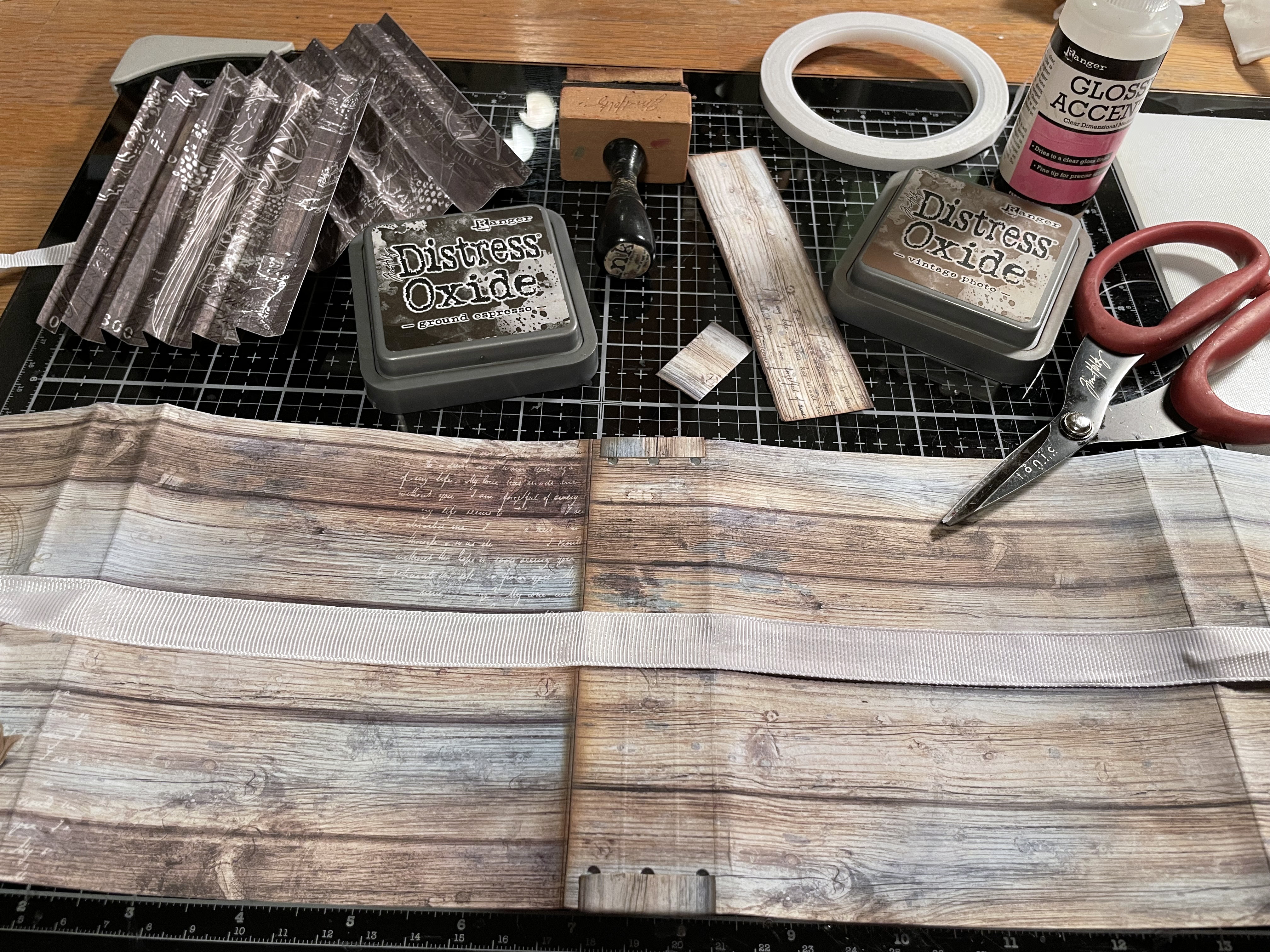
Here's one of the 'wood' sheets, so I chose it for my outside with one of the 'map' sheets
for the inside. Normally, I am one of those who insists on putting another cardstock in between
these layers, just for stability. Not this time; this Underwater Love stock is all that's needed!

I did my normal opposite layering (left blue to right blue then left wood to right wood)
since it always gives a good spine. I did use my usual Glossy Accents for adhering.
I also had a plan for the leftover strip up there at the top of this photo...you'll see.

After getting the outside and inside covers together, I chose a plain ribbed white ribbon for closure.
A 'slice' of that wood leftover became a sweet board to overlay onto the spine- inside and out.
It hid the holes as well as secured the closing ribbon.

I got out the compatible Eileen Hull Thin Die Set Page Pocket and Flowers
to cut pages and corner pockets. The leftover pieces of stock were cut into one-inch strips
just short of the length for the pages; for use in making the pages into tuck pockets themselves. 

Next, I used the other 2 compatible Eileen Hull Thin Die Sets. 
(Card Waterfall /Tags and Bookbinding/Label) for waterfall pages, the tags I planned to fill several pockets with, and the binding for the pages to layer onto. 

Then it was time for the assembly of all the inside.
I gave all the edges and corners (including the cover)
a bit of the TH Unchartered Mariner Oxide Ink, and heat dried everything.

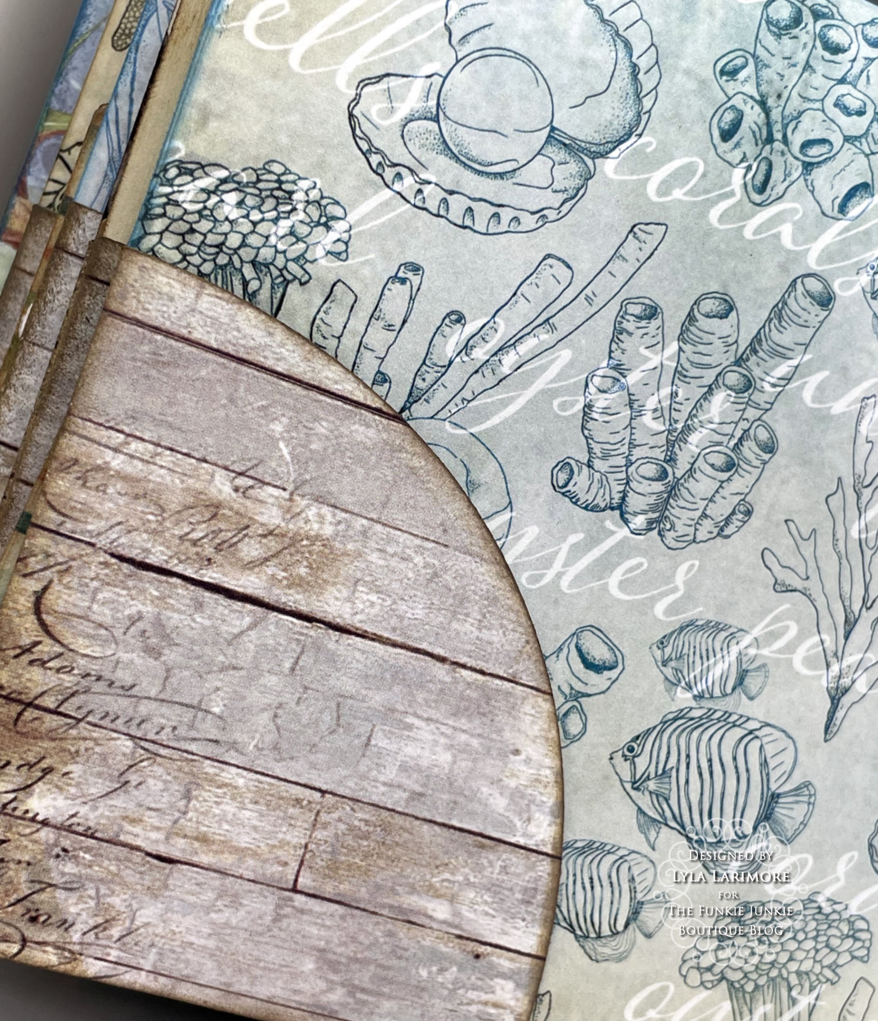
I'm showing how I put together my pages to form a pocket in the middle of them.
This page above, was to have nothing else on the outside.
Others will have tuck pockets on the outside lower corners.
You can see in the next pic, how I added the corner tuck spots before putting the pages together.


Making the top-to-bottom waterfall pages were easy.
I inked them up all around the edges and that Unchartered Mariner just PERFECTLY matched!

I used ALL the pages except for one: the mermaid/secrets page.
I did have plenty of leftovers even after cutting more tags than I initially had.
That 12x12 stack went pretty far!

Now, my only problem was to figure out what I wanted on the front of the entire book.
Flowers? Nah. Tim's Paper Dolls? Much as I love them...nah.
More wood cuts stacked up. Nah.
Everything I suggested got flat-out rejected by my ArtMuse.
A memory came out of nowhere, along with a voice in my head saying
"Less is more. Less is more!"
The memory is so peaceful: my favorite Happy Place...

I spied the bag of Tim Holtz goodies I have for a future project on my desk.
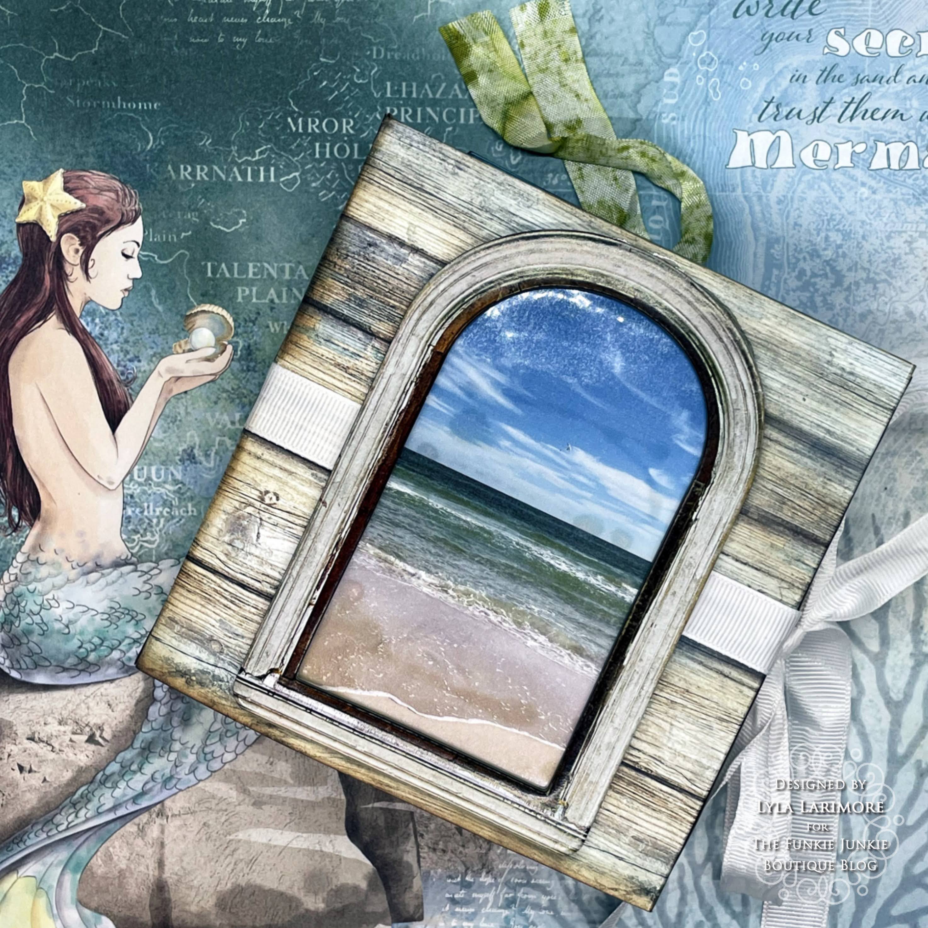
The package of TH IdeaOlogy Window Frames caught my eye.
Why not?
So I went to my computer, looked up the date to find 
that set of photos and found IT- the perfect shot.

After printing it out on regular white cardstock, I laminated it with clear shelf paper.
I used only one thing on the Window Frame: Distress Crayon in Speckled Egg all around the edges.


And it looked simple and simply amazing to me!


This is where that one strip of wood went to... cute, eh?


Some of the other 'wood' and fish paper...

... and more of the other side of these papers.

These are probably my favorite designs of the Underwater Love 12x12 Ciao Bella Paper.

You can find products I've used by clicking these links:

Eileen Hull Page Pockets & Flowers Die
Eileen Hull Bookbinding & Label Die
Eileen Hull Waterfall Pages & Tags Die
White Cardstock
Clear Contact Paper
White Ribbed Ribbon from Stash

I hope you've enjoyed Saturday Showcase for this last Saturday of July
as much as I enjoyed making this folio.
and get your entry in- you have until Tuesday at 11:55pm!

This new album will have some really good fillers:
I'll have plenty of space for photos of this year's vacation at Memaw's & Papaw's House!


Until next time...

Stay Safe &
HAPPY BLOGGING!