When I need a lift, my smile returns at the mere thought of my Grandbabies. I am 100% positive I'm not the only grandma who feels that way! (I'm smiling just thinking about it!) So many of my peers are joining me in this "granny thing", and the numbers are growing by the day- literally! Just about all of our kids' classmates have recently begun their own families either by getting married or starting to fill the nursery. Most of the news of these "kids" (I think we will always think of them as kids even as we see how capable they have become as adults) somehow makes its way to me via SM, and it's a very good feeling to be able to type "Congratulations!" onto their feed. It's the best news in life; sharing news of LIFE! It was recently announced that one of our Besties is having their first Grandbaby; due the very week our own (likely) last Grandbaby is due. Then they announced it was a girl; how exciting! And we received our own news the very next evening (which was younger Son, Brett's 30th Birthday): he and Holli just had an ultrasound that morning: It's a GIRL!! How blessed we feel to have 2 boys and 2 girls!! I actually sat and cried that next afternoon when I realized how 'perfect' GOD chose to give to us: 10 in our family. "Ten" numerically means "complete". On the other hand, if it turns out that it's not....lol....there'll always be room for more nuts on the Larimore Family Tree. I'm thinking this one's an Almond. ;)

The Funkie Junkie Boutique's newest Challenge is titled "A Study in Contrasts" with Lisa heading up this one. She's asking for us to highlight contrasts in our project, saying: "It could be themes, colors, textures or forms. We are looking forward to seeing your creative interpretations and juxtapositions of things that are contrasting!" I took on her idea in more than one way- scroll on!
My project began with one simple item- an old hanging file folder.
Get out your favorite cutting and scoring tools, and you're set to use your imagination!
I started by removing the metal hangars (carefully- they're usually pretty sharp)
and used the edges as a straight line to cut against for trimming off the folded edges.
I then set them out to the recycle barrel.
I kept the trimmed folded edges and sanded the cut sides a bit.
(Later, I'll wish I had sanded the inside glue residue- just to make sure it didn't end up in my photos!)
I set the trimmed, sanded edges aside and just from folding, knew I needed to trim off
a bit more from one side of the folder's top or bottom. Otherwise, it would overlap.
I knew I wanted to keep as many of the folds already there as possible.
So I chose 2 of those folds- the top (opposite of the excess trimmed top)
and the very last fold of the bottom.
As for making other folds: I wanted 2, so I scored at 5 inches and 10 inches.
You'll note from the photo above that the very far right is wider- to fold into 3 parts.
The key to getting any fold to lay flat: cut 'darts' or a V shape instead of just cutting straight.
This gives each edge some room when you fold them into the same shared space.
This means cutting that dart (or V shape) at each fold.
You can see I used my TH Sheers for this- to make one longer, smoother slice, rather than
using a shorter set of blades and shorter movements.
It was pretty easy to just follow the folded line, cutting along each side.
This is what I had when I finished the folding and cutting.
As completely folded.
I originally thought I might use my 3D Folders-
but space became a factor causing me to keep my inside design flat.
I wanted one pocket and this is where those cut off folded edges came in...
...one on each side, with the bottom folded up: a nice big pocket!
I still had one more cut off edge, so I took a 'page' from Tim Holtz' Folio
(which I have one for each Grandchild made up, and 2 more saved back, "just in case"
I got more...lol!)
and decided to put in extra pages here.
You'll see these in the finished photos below.
And then I got out some of my fave patterns of Tim paperie;
and began simply measuring each page for its cover paper.
I waited until very LAST to adhere all the paper covers onto the folder parts.
The folder would have expanded and made it harder to design the front and back.
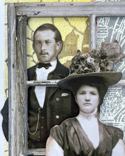
I actually did this last, but stuck the photo in at this point.
Inking some contrasting color along all the Tim paper edges and corners.
I did this by holding each in one hand, instead of flat on the Glass Mat.
That way, the color stood out more starkly, or so I thought.
After heat-drying each of the covers, I set them all aside so I could work on the
front and back covers of the folder while it was as flat as possible.
The first thing I did: use one of my fave TH Stamp Sets (Architecture).
After seeing this same stamp used by an entry in the last Challenge:
I made a decision after that "Blustery Challenge" to use my stamps and stencils more.Practice makes perfect, only if I try!
I fell in love with her embossed stamping that stood out yet stayed in the background,
and thought it was a good start to handle.
I actually managed to stamp and emboss each only ONE TIME successfully,
without two tons of rethinking each move. Progress!
Thanks, Jo, for that inspiration!!
That gave me one part of my planned contrast in textures.
Next up: stencil practice- for more texture contrast.
This is always fun for me, but challenging to decide where and how much to use it.
I'm deciding to JUST DO IT and live with what it is.
Being picky can come later- after mastering not making a complete mess, lol.
You'll note here: the TH Stencil is actually backwards...
...that was done so I could flip it and match the two sides together.
After it dried, I used my TH Sander to rub a bit off where it met together and smooth it out.
Some edging done in Distress Ink to the stamped image,
and Distress Crayon to the Window and Quote Chip...
...more Distress to the metal IdeaOlogy pieces, and a bit of (retired) Distress Emboss
for rusty Mini Gears... adding to the conrasting texture- as well as
CONTRASTNG COLORS for that 'pop' needed.
The leftover from all the cutting whispered to me that it all wanted to be
used as inserts for more journaling/photo space inside the folder.
Yeah, I'm deaf.
But I swear to you; this stuff TALKS to me!! ;)
Instead of making them into Tags, I got out the TH Tiny Attacher to keep
the smaller pieces together with a larger. It also helped keep everything flat.
My main Tools and Materials:
(Click on the wording for info link.)
We've been doing more "building"- mostly fixing things that need being redonehere in the Indiana house. Hopefully, we'll get both the inside and outside projects caught up before the summer gets here and allows us time to spend with family and friends.
You can tell- from my choices here- it's been on my mind.
I played with the wording since it was both building the folder as well
as being a "Building Folder" where I could tuck in notes or photos along the way.
I scrubbed some of that yummy TH Distress Oxide in Salvaged Patina across this
after using the Tim Holtz 3D "Mechanics" Texture Fade (regular size).
(I listed the Mini -which I found available- above.)
Yes; I did choose to leave some parts uncovered.
This file folder had a nice shade of brown, whereas the rest of them I had
were all a greenish color. So I was tempted to leave some of the brown showing.
Fully opened...
...with flipping pages in the upper right corner panels.
YES! I couldn't resist the matching shade of Tim's newest Distress color Saltwater Taffy!!
These little blossoms are just the perfect touch here- so SPRING!
The color contrasted so nicely with TH Distress Paint Salvaged Patina used on the Industrial piece.
Those same Peach Tea Prima Marketing as used in my previous projects:
and
Tim's IdeaOlogy Paper Dolls are just too much fun!
I was very pleased it worked out well as a flat folder that could show off some nice photos.
Grab one of those old files and use it for the backing
- keep it simple, or go for more complicated than I did.
Stack on some layers of contrasting papers, colors, or textures.
Add a few bits and bobs, and ribbon for some fun.
Write in a sentiment, and you've got an instant card for a gift!
It's that easy!
Be sure to follow the simple rules and upload a photo of your make at
YOU could win a $25 GC
Sponsored by:
THANKS! for all the LOVE in likes and SWEET comments for all my recent projects!
I've been so inspired by so many hugely talented folks out there,
so I must give credit where it's due; it's all about sharing ideas!
I hope my take on these makes inspire others to take up their
tools and go one step...or more...further!
GOD willing; there's always more to come. ;)
Until next time...
Stay Safe &
HAPPY BLOGGING!


3 comments:
Brilliant design! The flaps and folds are spectacular! Congratulations!
This is beautiful! I love how you used the hanging folder to create this! Thank you for sharing your steps :)
This is such a cool project and since I am 'engineerically' challenged, I'm going to refer back to it to make a little folder of my own. Love the contrast of the soft colors with the neutrals. Brilliant! And as always love to read your opening. Congratulations on the new almond!
Post a Comment